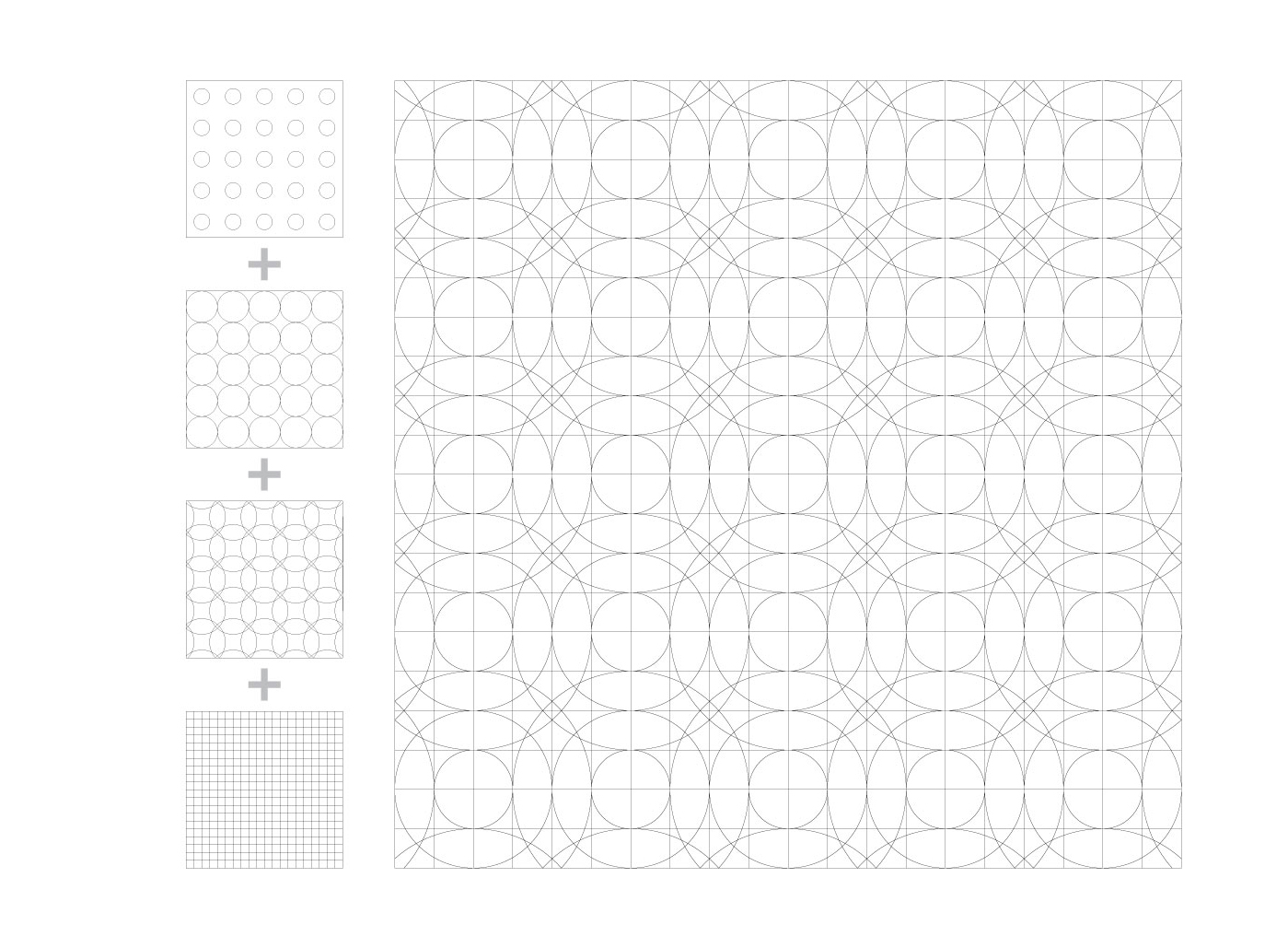
The visual identity of this exhibition is based on the grid system that reflects the school of visual arts community.
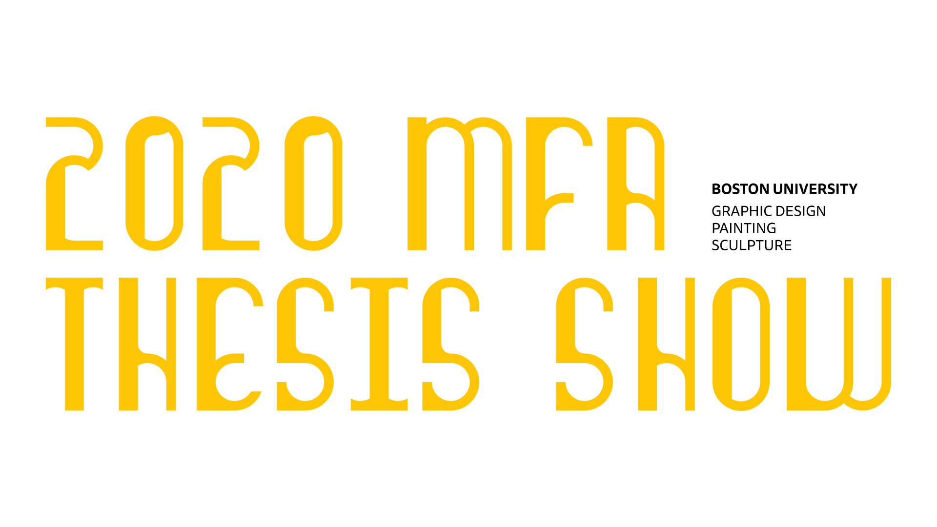
TYPEFACE
We created our display typeface, Fairy, with three weights narrow, fishy and chunky. The layering of these three references our three programs housed in one school.


Chunky is the heaviest weight of the three, so it always appears on the bottom; Fishy is the transitional typeface, featuring heavier terminals and thin strokes. This alphabet always appears in the middle of the layering; Narrow is the last alphabet, the lightest weight of all three, and always appears as the top layer.
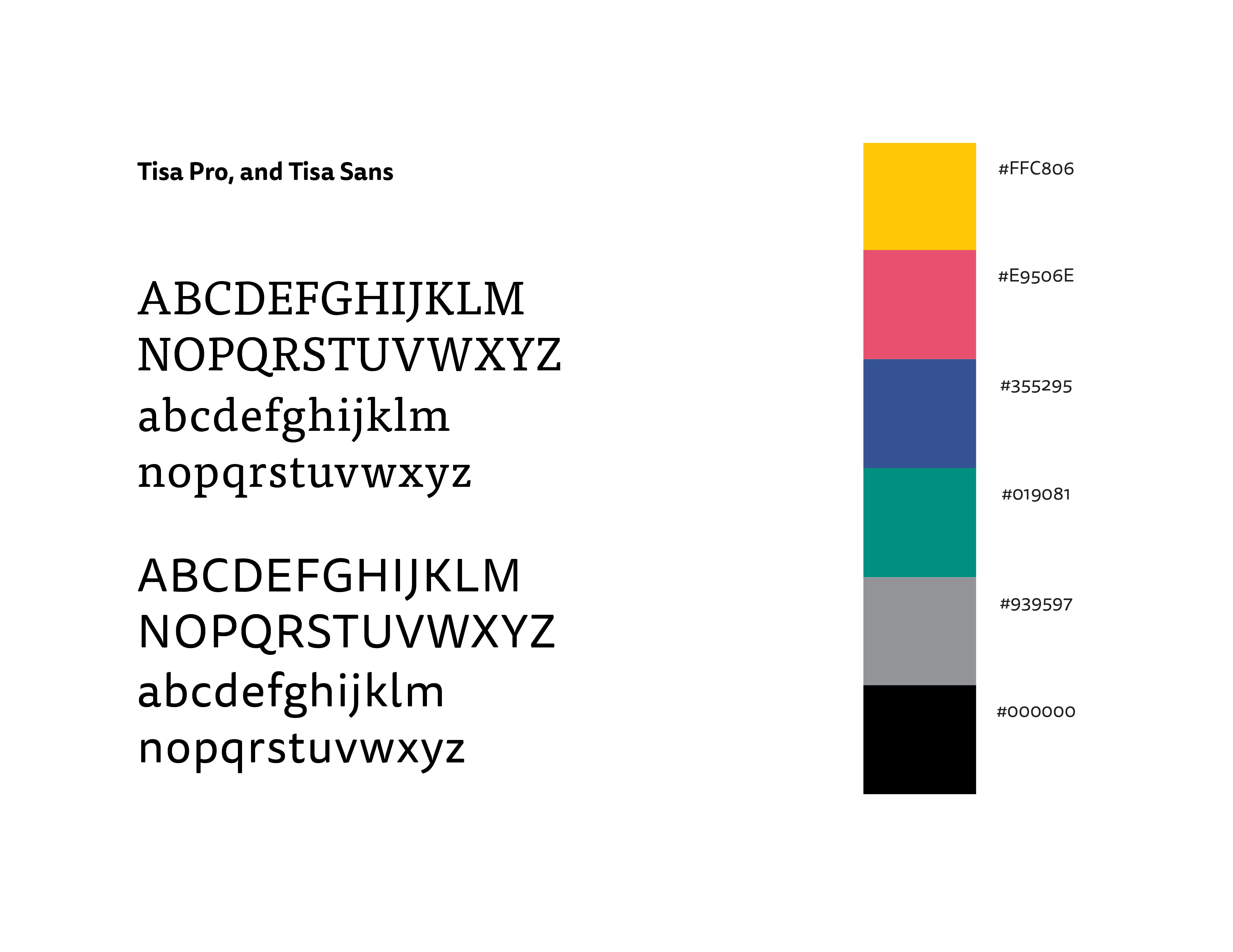
SECONDARY TYPEFACE
Tisa is a serif typeface created by Slovenian designer Mitja Miklavčič in 2006. It has a large x-height, which offers excellent legibility, and it is an excellent choice for setting long passages of text on the web.COLOR
We choose three primary colors and two secondary colors to represent our diversity in this school. 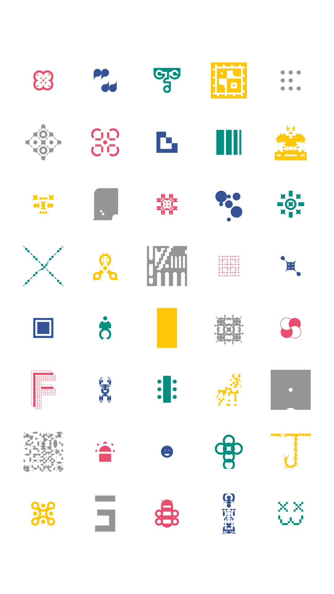

CONDITIONAL DESIGN
Each student created a unique shape based on the grid, and the shapes work together to create a larger visual identity.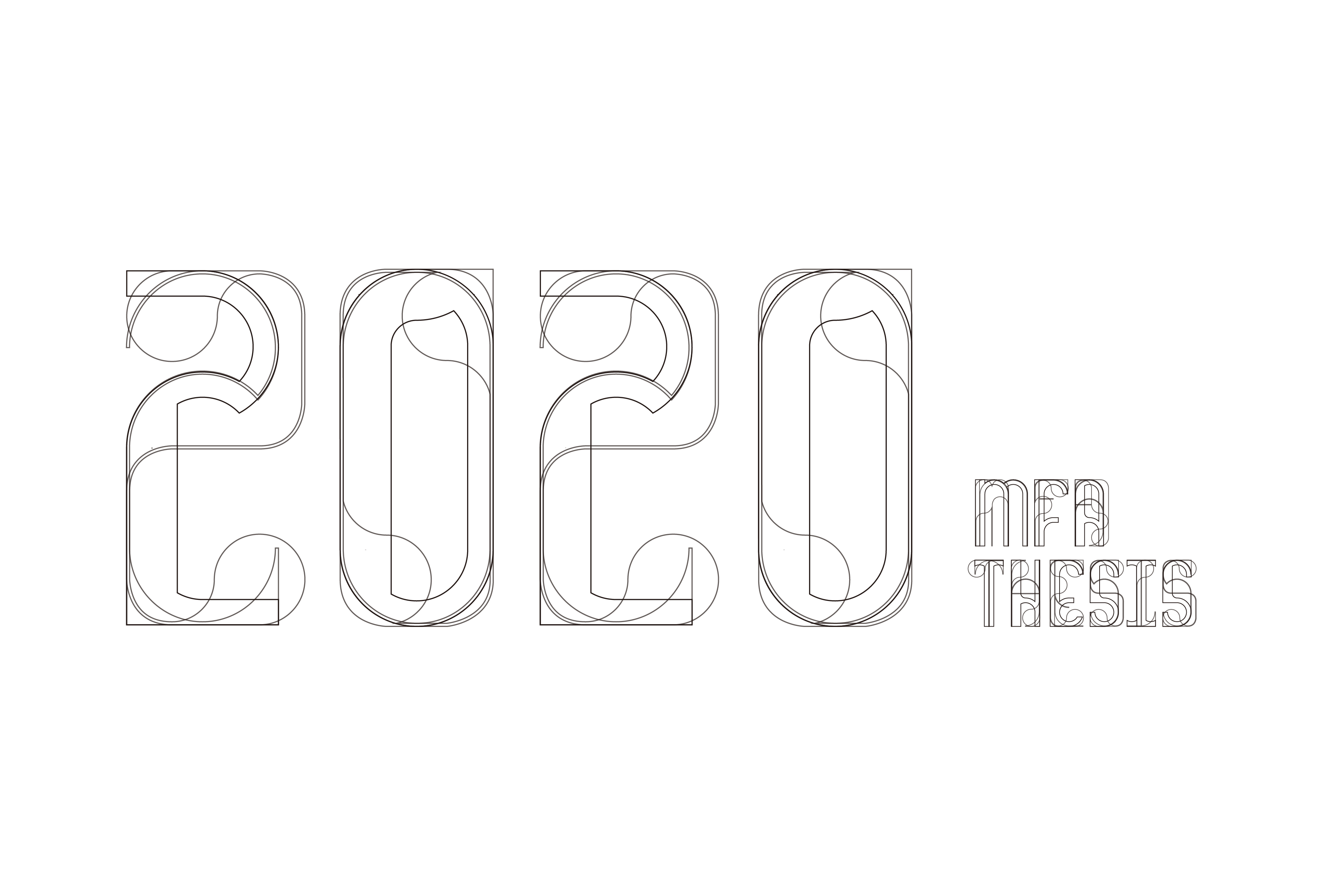
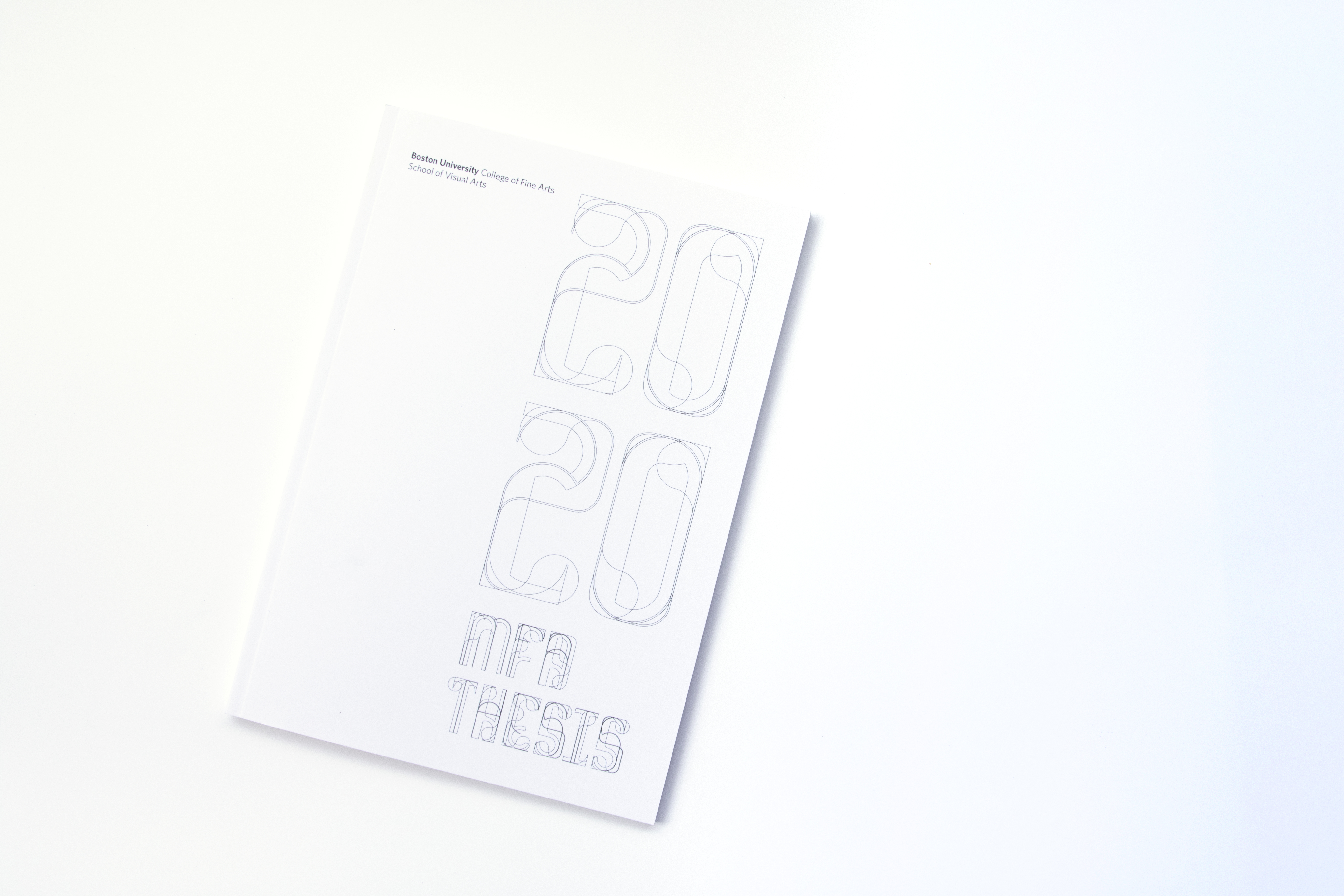
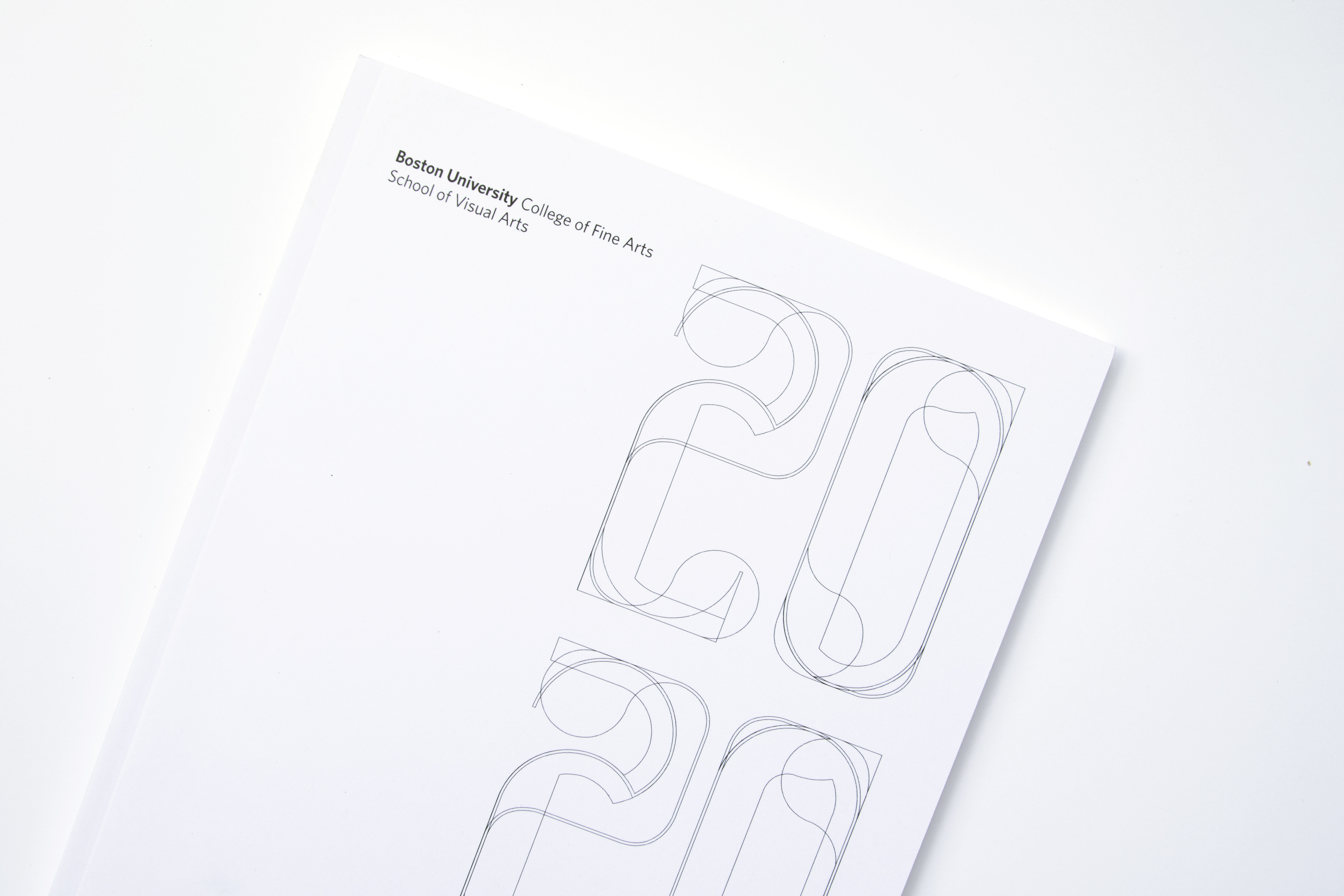

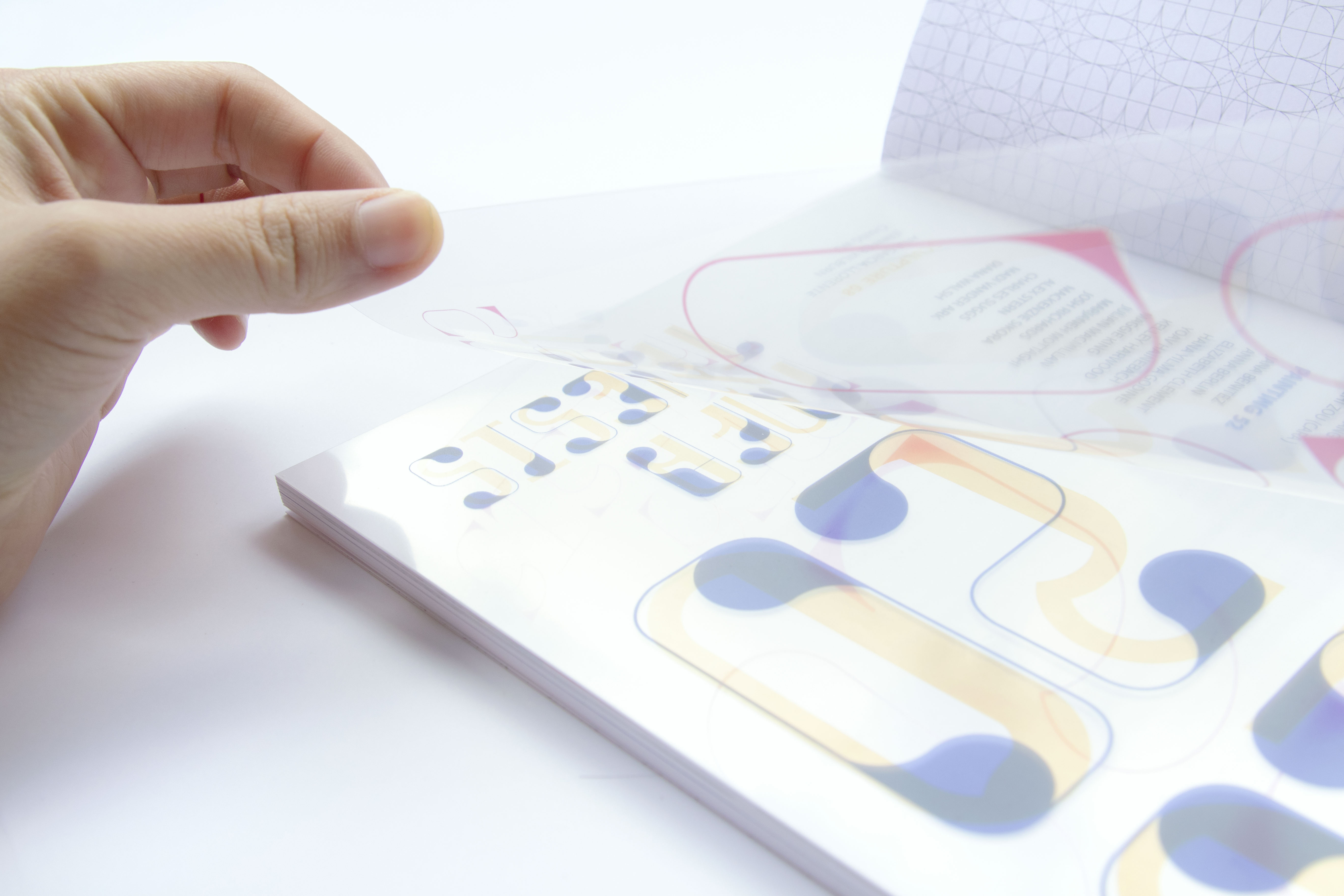
THESIS CATALOGUE
This is the 2020 MFA Thesis Catalogue. The first two pages of the catalog are printed on a translucent paper, enabling you to see the typefaces and the list of students in each program individually and together. Preview the 2020 MFA Thesis Catalogue
2020 MFA ONLINE THESIS SHOW
This online showcase is published on the occasion of the 2020 Master of Fine Arts Thesis of Boston University College of Fine Arts School of Visual Arts. It represents the culmination of two years of intensive studio work by 40 MFA candidates in Graphic Design, Painting, and Sculpture.2020mfathesis.show
2020 MFA ONLINE THESIS SHOW (SOCIAL MEDIA)
We made an instagram to showcase work by each student. Because of the current situation, it was helpful to have this virtual platform to continue showcasing work, while being consistent with our branding. Every student has a post with their shape, and for those who submitted for instagram, images of their work follows their shape.
www.instagram.com/bu.mfa.thesis.show/